By the end of this session you will be able to:
- use CSS classes
- build layouts like a real website
Recap from Week 4
Last week you learned how to:
- Understand what CSS is
- Change colours and styles on your website
- Create more pages for your website
- Link pages together
Step 1: HTML classes
When you use the <h3> tag, your browser automatically tags the text as bigger and bolder.
We saw in the last lesson that you can make your headings look different with CSS.
But every <h3> tag looks the same. What if we want some of our <h3> headings to look different to others?
This is where class selectors come in. A class is like a shared label. Lots of elements can use the same class to get the same style.
For example:
color: black;
}
.blue {
color: blue
}
<p class="blue"> The text in this paragraph is blue </p>
<h1> The text in this heading is black </h1>
In the code above, we defined in the CSS stylesheet that all <h1> tags should have black text. But we also defined that anything with the "blue" class must have blue text.
Any element with the "blue" class, no matter what kind, will have blue text; headings, paragraphs, lists - anything!. But only when you include the class!
💡 Tip: CSS always applies the most specific selector. Class selectors override tag selectors.
Challenge
Create a class in your own CSS stylesheet. Try changing the styling of some of your paragraphs and headings to use the new class.
Now try adding it to something unexpected, like a list. What happens?
💡 Tip: Use sensible, descriptive class names. Don't call a class which turns text red "blue" or "class1"
Bonus
A stylesheet which is used by all of the pages in your website is called a global stylesheet.
Global stylesheets are very useful because you don't have to have a separate stylesheet for every page, and you can make your pages all follow the same theme.
Classes are useful in a global stylesheet for giving you more control over what each page and element looks like.
Step 2: Box model
We talked in an earlier lesson about treating tags like boxes. Every element is a box with space inside and space outside. The CSS Box Model lets you decide how big or small your box is, and what it looks like.
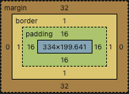
This picture shows the box model for each section of this page. In the middle, in blue, is the content for the lesson. Surrounding this is the padding, in green, which is empty space between the content and the border. Next is the border, one pixel wide. Finally we have a margin, which is more empty space outside of the border.
The box model can be used to manage the layout of your page and make sure there is enough space between the different elements on your page.
Challenge
Add the following code to your stylesheet:
CSS:
border: 2px solid black;
padding: 10px;
margin: 10px;
}
HTML:
Refresh your page. You should see a box appear. Try this:
- change the colour of your border
- change the style of your border from solid to dotted line
- change the thickness of the border
- change the gap between the content and the border
- change the gap between the border and the elements above and below it
Step 3: Semantic HTML
It helps to break your pages up into sections. HTML offers lots of tags to help with this.
You can split your page into sections using tags like <div>, <span> and <section>. You can apply different box models and classes to these in order to decorate and lay out your page exactly how you want.
But these tags don't tell you anything about what goes in them.
It is better to use semantic elements. A semantic element tells the browser and the developer (the person making the webpage) what should be in it.
Some examples of semantic elements are:
- <header>
- <nav>
- <main>
- <section>
- <footer>
- <aside>
Challenge
Inspect this page to find out how semantic HTML is used to split up the page into different sections.
Find the CSS stylesheet and note how the box model is used to put spaces between the different sections
Can you do something similar on your page?